Doist, the company behind Todoist and Twist, has revamped its internal communication product Twist. When I first covered Twist, I said it was like Slack without the annoying distractions. With today’s redesign, the company is doubling down on that idea. The result is an opinionated tool for internal conversations that should help you focus and keep the team on track.
While Doist started working on Twist way before the coronavirus pandemic, it feels like Twist is more relevant than ever. Over the past couple of years, many teams started working remotely for the first time. Some companies that had a Microsoft 365 subscription started using Microsoft Teams, other companies spent a lot of time in Zoom meetings.
Doist founder Amir Salihefendic thinks those tools don’t work well. He has been promoting asynchronous communication for years. Slack or Microsoft Teams interrupt you all the time with notifications and chat messages. It’s hard to keep up, especially if you don’t work in the same time zone as the rest of the team. And it’s impossible to have two conversations at the same time in the same channel.
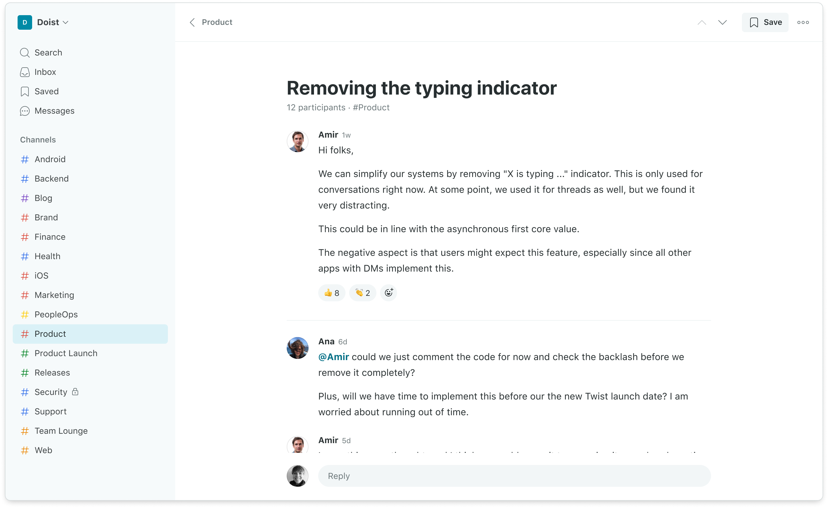
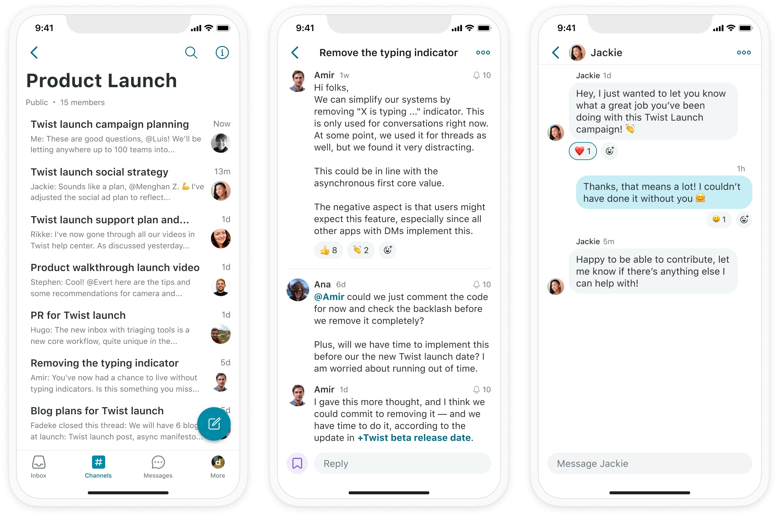
Twist’s strongest differentiating point with Slack is still there. In Twist, every conversation is a thread. If you want to start a conversation, you click on a channel, such as #design, #ios or #support, and then you start a thread with a title and some body text. After you posted a new thread, other users can add comments, react with emojis and you can tag people.

Image Credits: Twist
If you want to send quick feedback, ask a question to someone specifically or have a private conversation, Twist also lets you send direct messages to other users. But it’s the equivalent of sending a text message as those conversations are not meant to hold important work conversations.
The interface has been completely redesigned. The product has a cleaner look that helps you focus on what you’re looking at right now. Instead of a three-column layout with channels on the left, a list of threads in the center and the current open thread on the right, Dois has opted for a two-column layout that lets you focus on the current thread.
When you open a thread, it fills up most of the interface so that you can follow conversations better. You don’t get distracted with new comments in other threads as you can’t see the list of other threads.

Image Credits: Twist
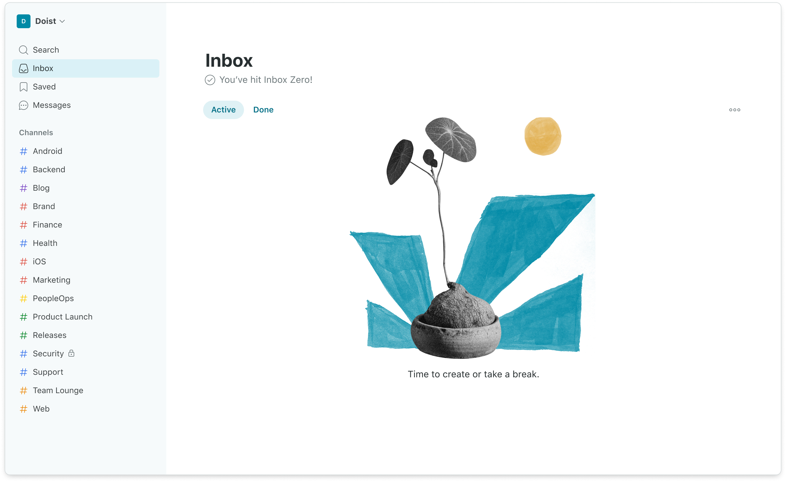
The inbox view has been redesigned to help you see what you missed when you weren’t looking at Twist. From this view, you can see new content in the threads that you’re following. You can read those threads, add comments and more. Once you think you’re done interacting with a thread, you can mark it as done. Twist moves the thread from your inbox to the ‘Done’ view.
Other new features in today’s release include new keyboard shortcuts to help you move from one thread to another and a better search feature. The product costs $5 per user and per month if you sign up to a yearly plan. There’s a free option to try out the product but you can only see one month of comments and messages.

Image Credits: Twist
"work" - Google News
October 13, 2021 at 01:14AM
https://ift.tt/3DD3akG
Doist redesigns Twist, the Slack alternative focused on async work - TechCrunch
"work" - Google News
https://ift.tt/3bUEaYA
Bagikan Berita Ini


0 Response to "Doist redesigns Twist, the Slack alternative focused on async work - TechCrunch"
Post a Comment